A hand-drawn React component library with a sketchy, notebook aesthetic. 20 fully typed components with wobbly borders, paper textures, and pencil-line details, for side projects, landing pages, or anywhere you want to stand out.
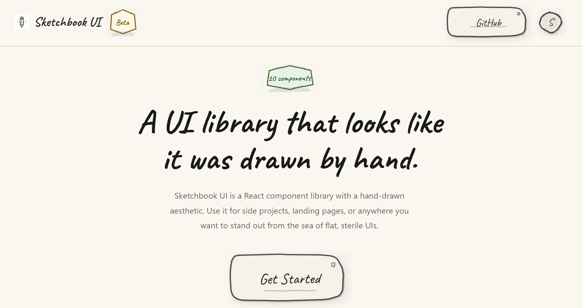
- 20 components (Button, Input, Modal, Accordion, Toast, etc.)
- Hand-drawn SVG borders, paper textures, and subtle animations
- Fully typed with TypeScript
- Themeable via
colorsandtypographyprops on every component - Zero runtime dependencies beyond React
- Tree-shakeable, under 70 kB gzipped
Browse all components and their variants in the Storybook docs.
npm install sketchbook-ui
# or
yarn add sketchbook-ui
# or
pnpm add sketchbook-uiMake sure you have React installed:
npm install react react-domImport the Sketchbook UI styles in your main entry file (e.g., main.tsx or App.tsx):
import 'sketchbook-ui/style.css';import { Button, Input, Card, SketchProvider } from 'sketchbook-ui';
function App() {
return (
<SketchProvider>
<Card>
<h1>Welcome to Sketchbook UI!</h1>
<Input label="Name" placeholder="Type here..." />
<Button>Submit</Button>
</Card>
</SketchProvider>
);
}Every component accepts colors and typography props for customization:
import { Button } from 'sketchbook-ui';

<Button
  colors={{
    bg: '#ffeb3b',
    stroke: '#000',
    text: '#000'
  }}
  typography={{
    fontSize: '2rem',
    fontFamily: 'Caveat, cursive'
  }}
>
  Custom Button
</Button>- Form Controls: Button, Input, Textarea, Checkbox, Switch, Select, RadioGroup, Slider
- Data Display: Badge, Avatar, Card, Divider, Progress, Skeleton (with SkeletonText, SkeletonCard), Spinner, Tooltip
- Feedback: Toast (with ToastContainer and useToast hook), Modal
- Navigation: Dropdown, Accordion (with AccordionItem)
Sketchbook UI is written in TypeScript and includes full type definitions. All components are fully typed with proper prop interfaces.
The library is built with tree-shaking support. Only the components you import will be included in your bundle:
// Only Button will be bundled
import { Button } from 'sketchbook-ui';Please read the contributing guide.
Licensed under the MIT license.